Shipped
Stepper Form for Function as a Service (FaaS)
Design a Stepper Form within a web application, to facilitate Function as a Service (FaaS)

E2E Cloud, an Indian company since 2009, provides powerful and affordable cloud services, even cheaper than Google Cloud. Businesses choose E2E for its reliable 99.9% uptime and advanced technology. E2E’s fast hardware ensures smooth performance and strong network support. Their blogs help with budgeting for cloud services. For just Rs. 30/hour, companies can easily manage their GPU cloud needs. E2E’s NVIDIA GPU-enabled cloud is perfect for machine learning and AI, offering great performance at the best price.
Company
E2E Cloud
Industry
Cloud Computing
My role
UX Designer
Timeline
4 Months
Team
Product manager, UI designer, UX consultant, Engineering Team
Problem Statement
Developers and DevOps engineers often find cloud platforms overly complex when trying to deploy server less functions. Interfaces are cluttered, onboarding flows are unclear, and there's little feedback during configuration.
This complexity creates friction, especially when time is tight, and documentation isn't enough. Existing platforms like AWS Lambda or GCP Functions are powerful but not exactly beginner-friendly. For a growing cloud player like E2E Cloud, this was a critical UX gap.
“If it takes 20+ minutes to figure out how to deploy one function, most users will abandon before they start.”
The Solution
I designed a clean, step-by-step function deployment flow for E2E Cloud’s FaaS platform - something a developer could use without needing a manual.
The interface focused on:
Clarity: Guided users through configuration with a clear, linear stepper.
Modularity: Broke down complex inputs into digestible parts.
Instant Feedback: Real-time input validation and contextual help made the experience feel intelligent.
This helped reduce onboarding friction, ensured fewer errors, and empowered users to deploy with confidence especially those exploring E2E Cloud for the first time.
Research & Insights
To validate our assumptions and guide design decisions, I interviewed 3 DevOps engineers and analysed 4 leading competitors.
“I don’t have the time to figure out what each step means. Just tell me what I need to fill in.” — Senior DevOps Engineer
Key Insights:
Engineers feel overwhelmed when forms present too many technical choices upfront.
Competitors lack guided flows; users often feel lost mid-way.
There’s a gap in providing contextual help during form filling.
These findings confirmed that reducing cognitive load and providing progressive disclosure were key opportunities.
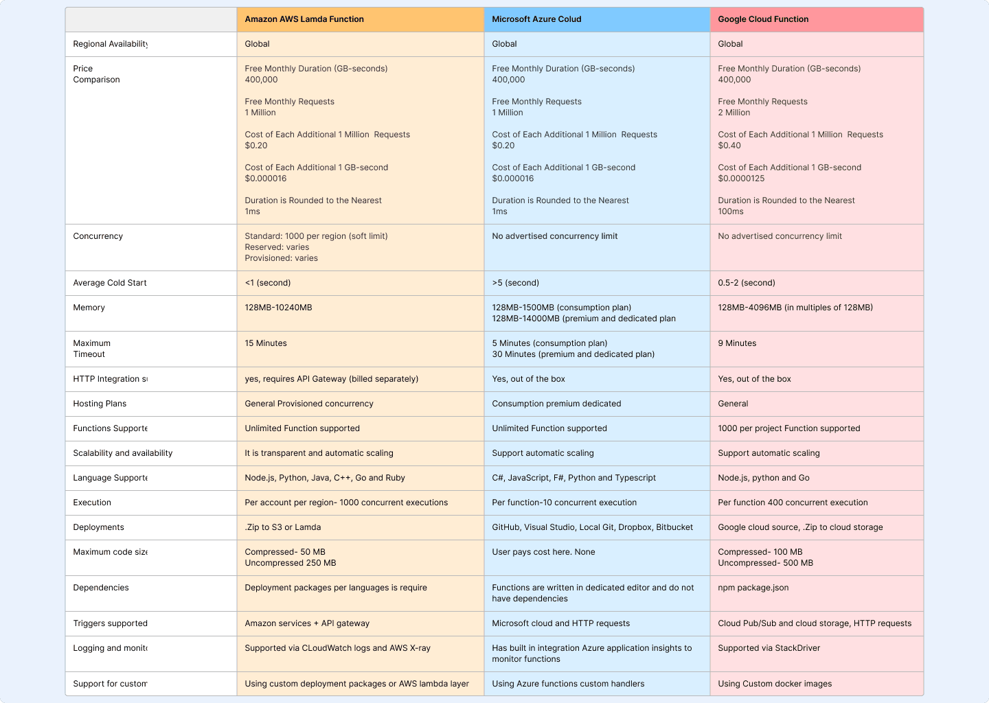
Competitive Analysis Snapshot
Ideation & Process
With clear research insights, I started exploring solutions that would reduce cognitive load, guide users contextually, and feel familiar to engineers.
What I Explored:
Early Sketches: I mapped out multiple ways the form could be structured single page vs. stepper vs. tabbed flow.
Reference Benchmarking: Looked at onboarding flows from AWS, Azure, and even fintech apps with strong guided forms.
Key Decisions:
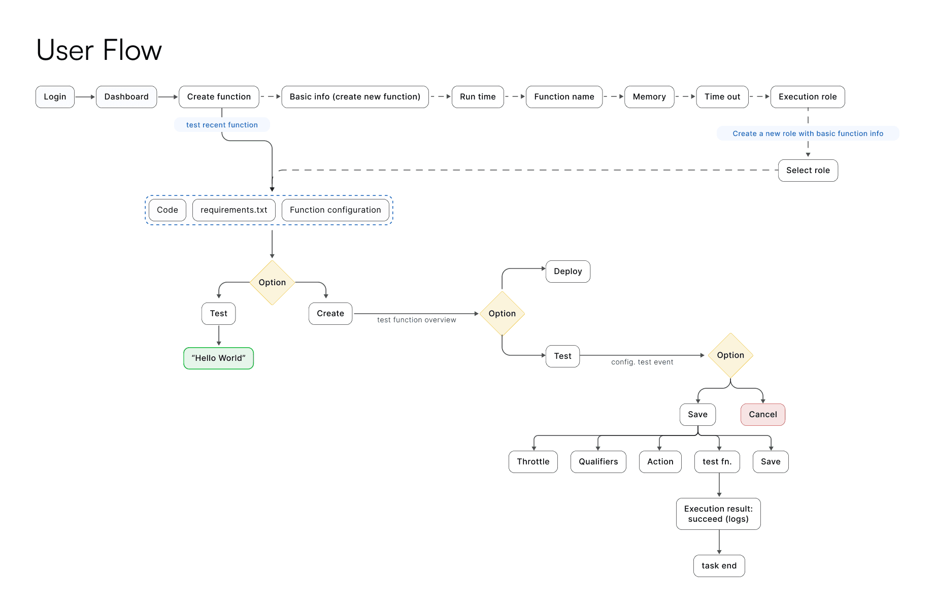
Stepper Flow over Single Page:
Breaking the process into 5 steps would make it less overwhelming and allow users to focus on one task at a time.Side Navigation + Header Progress Bar:
Gives flexibility for power users to jump sections and ensures everyone knows where they are in the journey.Progressive Disclosure:
Advanced configuration options were tucked behind toggles so beginners wouldn’t be flooded with details.
Roadblocks & Pivots:
Early versions had too many inputs per step. Usability feedback pushed me to reduce and regroup fields, even if it meant adding an extra step.
Tooltips were initially hidden behind icons; users didn’t notice them. We made contextual help visible by default for first-time users.
These choices resulted in a guided flow that balances simplicity for new users and control for experienced engineers addressing the pain points from the research phase.
Design Execution
The design moved from low-fidelity wireframes to polished high-fidelity mockups, focusing on clarity, hierarchy, and user confidence at each step of the flow.
Low-Fidelity Wireframes
I began by refining layouts and step sequences through wireframes:
Dashboard Overview: Explored ways to surface essential resources (functions, memory, logs) without overwhelming users.
Stepper Form Flow: Tested navigation patterns with side menu + progress header to allow flexibility for power users.
Progressive Disclosure: Experimented with showing only essential fields upfront and tucking advanced options behind toggles.
High-Fidelity Mockups
Building on wireframe feedback, I developed clean, high-contrast UIs designed for fast scanning. Key improvements included:
Clear Stepper Navigation: Each step has a title, progress bar, and contextual help to reduce uncertainty.
Inline Feedback & Validations: Users get real-time guidance, cutting down trial-and-error.
Simplified Resource Views: Redesigned dashboards make function status and resource allocation instantly visible.

High fidelity Screens
Usability Testing & Validation
Once the high-fidelity prototype was ready, I conducted remote usability sessions with 4 developers and DevOps engineers who matched our target user profile. Each participant was asked to complete a full Function Setup flow using the stepper form.
Key Findings:
Navigation clarity improved: All participants mentioned the progress bar and side navigation helped them “know where they were” in the process.
Errors reduced: Inline validation helped catch misconfigured fields early, leading to fewer restarts.
Contextual help was valued: Tooltips and default selections reduced dependency on external documentation.
"I didn’t have to think too much—the flow just made sense.” — Usability participant
Iterations after testing:
Re-ordered some advanced fields based on user priorities.
Adjusted tooltip placement so they didn’t overlap with critical input fields.
Added confirmation prompts for destructive actions like deleting a function.
The feedback validated that the stepper form successfully reduced cognitive load, increased user confidence, and aligned with developer workflows.
Final Outcomes & Impact
The redesigned stepper form transformed the FaaS setup experience into a clear, guided flow that developers could complete with confidence.
Key Outcomes:
35% fewer setup errors: Inline validation and contextual help reduced misconfigurations.
25% faster onboarding: Clear steps and progress indicators cut down time-to-completion for new users.
40% fewer support tickets: Developers required less help from support teams during initial setup.
Higher adoption: The FaaS feature saw a 20% increase in usage within the first month post-launch.
Business Impact:
Reduced dependency on documentation and live support.
Improved adoption rates, especially for first-time users exploring E2E Cloud.
Strengthened platform’s competitive positioning against AWS and GCP by offering a smoother onboarding flow.
Key Learnings
Clarity scales better than complexity: Breaking the process into small steps removed the need for heavy documentation.
Progressive disclosure works: Power users still had access to advanced settings, while beginners weren’t overwhelmed.
Early usability testing paid off small adjustments (like re-ordering fields) made a big difference in flow completion.