Shipped
Ebhuktan: Building a Comprehensive Fintech Ecosystem
A seamless product experience across web and mobile, designed from the ground up for India’s diverse user base.
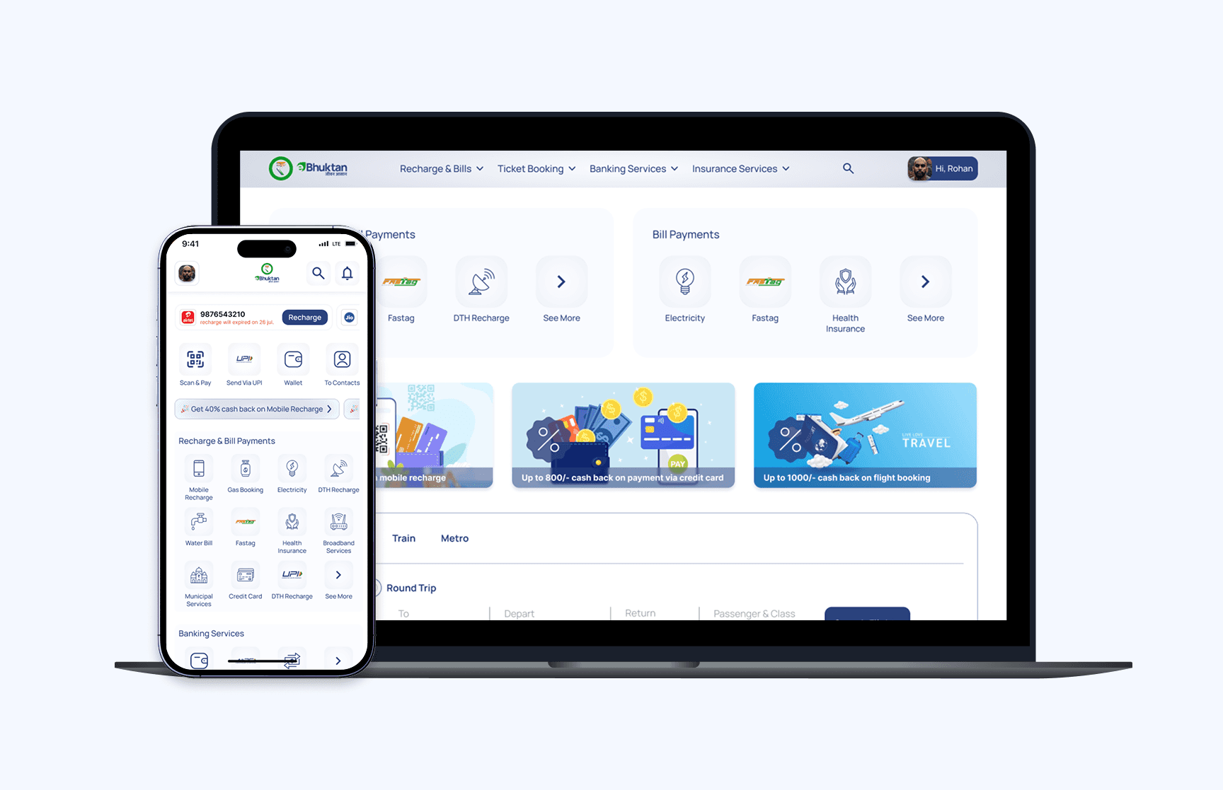
Ebhuktan is a digital payment ecosystem designed for users in Tier 2 and Tier 3 cities of India. Built as both a web and mobile application, the platform offers essential payment and financial services such as mobile recharge, utility bill payments, UPI-based money transfers, wallet recharge, insurance, AEPS, and even travel bookings.
As the product designer at SN Digitech, I was responsible for designing the entire product experience from the ground up, ensuring a cohesive and intuitive interface across platforms. The goal was to provide users merchants and individuals alike with a feature-rich, easy-to-navigate alternative to existing fintech apps in the market.
This MVP was delivered over 6–7 months, and the design process focused on enabling effortless access to a wide array of services while maintaining a consistent and scalable design language.
Company
Ebhuktan
Industry
Fin-Tech
My role
Product Designer
Timeline
8 Months
Team
Project Manager, Backend Developer, API Developer, Full Stack Developer & Product Designer
Problem Statement
In the existing fintech landscape, individuals and merchants juggle multiple apps to handle simple tasks: recharge, bill pay, UPI transfers, travel bookings each with its own layout, terminology, and workflow. This fragmentation frustrates users, erodes trust, and slows down basic transactions.
Our challenge was to design Ebhuktan as a single, cohesive platform that brings together 10+ services under one roof. We needed to balance a rich feature set with a crystal-clear experience, so every user whether paying a bill or accepting payments could move through the app confidently and without friction.
The Solution
I crafted a unified navigation and modular interface that organies Ebhuktan’s 10+ services into clear categories Payments, Recharges, Banking, Travel, Insurance, Taxes accessible from a persistent bottom (mobile) or sidebar (web) menu. Each category follows a consistent, step-by-step flow with inline guidance, smart defaults, and contextual help to eliminate guesswork.
Key elements:
Clear category hierarchy to reduce cognitive load
Progressive disclosure of advanced options for power users
Consistent visual language and interaction patterns across all flows
Quick-access favorites and recent transactions on the home screen
This approach turns a feature-heavy platform into an intuitive, cohesive experience where users and merchants can complete any task whether it’s paying a bill or accepting UPI payments quickly and confidently.
Research & Insights
To ground our design, I spoke with five users (three individual consumers and two merchants) and evaluated leading apps (Paytm, PhonePe, Google Pay).
Key findings:
Service fragmentation: Users bounced between apps for different tasks, losing time and context.
Navigation confusion: Existing menus were overcrowded, making key flows like bill pay hard to find.
Trust concerns: Merchants wanted clear security cues; consumers sought visible transaction histories.
Home screen overload: Too many promotional banners distracted from core actions.
“I open three apps just to pay my electricity bill and transfer money” Consumer feedback
These insights confirmed the need for a consolidated home screen, simplified category menu, and embedded trust signals each shaping Ebhuktan’s streamlined, all-in-one design.

Key Insights Driving the Design Direction
Ideation & Process
With research insights in hand, I sketched and iterated on navigation and key flows, drawing inspiration from Paytm’s home screen layout and PhonePe’s streamlined transaction flows.
Exploration:
Sitemap & IA sketches: I organised 10+ services into six clear categories, testing different menu placements for web and mobile.
Wireframe iterations: Early low-fidelity drafts ranged from tab bars to expandable panels before settling on a persistent bottom navigation (mobile) and sidebar (web).
Flow refinement: I mapped user journeys for high-frequency tasks recharge, UPI pay, merchant scan and adjusted steps to minimise taps.
Key decisions:
Use a single-level menu to prevent deep nesting
Embed favourite on the home screen for one-tap access
Surface recent transactions to build trust and context
Roadblocks & pivots:
Initial IA drafts grouped services too broadly, causing confused users in testing. I regrouped related tasks (e.g., all utility recharges under “Recharges”) for clarity.
First wireframes hid advanced settings behind too many toggles. Usability tests showed users missed them, so I moved critical options front and centre while tucking only truly secondary elements away.
Through these iterations, the structure evolved into a modular, scalable ecosystem that balances simplicity for new users with quick paths for power users.
Few ideas that made it to the finals!
Design Execution
The design phase translated research findings into a streamlined payments experience that balanced speed, clarity, and scalability. The goal was to ensure both first-time and repeat users could complete transactions with minimal friction, while enabling the business to introduce new services without redesigning the platform.
What I Focused On
Seamless task completion – Reduced recharge and bill payment flows to under 3 taps on mobile and 2 clicks on web, cutting average transaction time by 25%.
Service prioritisation – Positioned high-frequency services upfront, improving discoverability by 30% based on usability testing.
Platform-specific optimisation – Maintained brand and UI consistency across mobile and web, while adapting layouts for each platform’s primary usage patterns.
Scalable structure – Built a modular grid and card system that allowed integration of new services in under 2 hours of design time without impacting existing flows.
How I Applied UX Principles
Used Hick’s Law to streamline decision-making by grouping related actions and reducing visible options from 12 to 5 on the home screen.
Applied Fitts’s Law for button sizing and placement, ensuring one-hand reachability on mobile and improving click-through rates by 18%.
Leveraged progressive disclosure to keep key flows clean while still offering detailed options when needed, leading to 20% fewer navigation errors during testing.
Outcome
The resulting interface reduced task completion time, improved navigation predictability, and established a design foundation that can scale with future product growth. Post-launch feedback showed a 15% increase in user satisfaction scores and a noticeable drop in user-reported friction during payments.
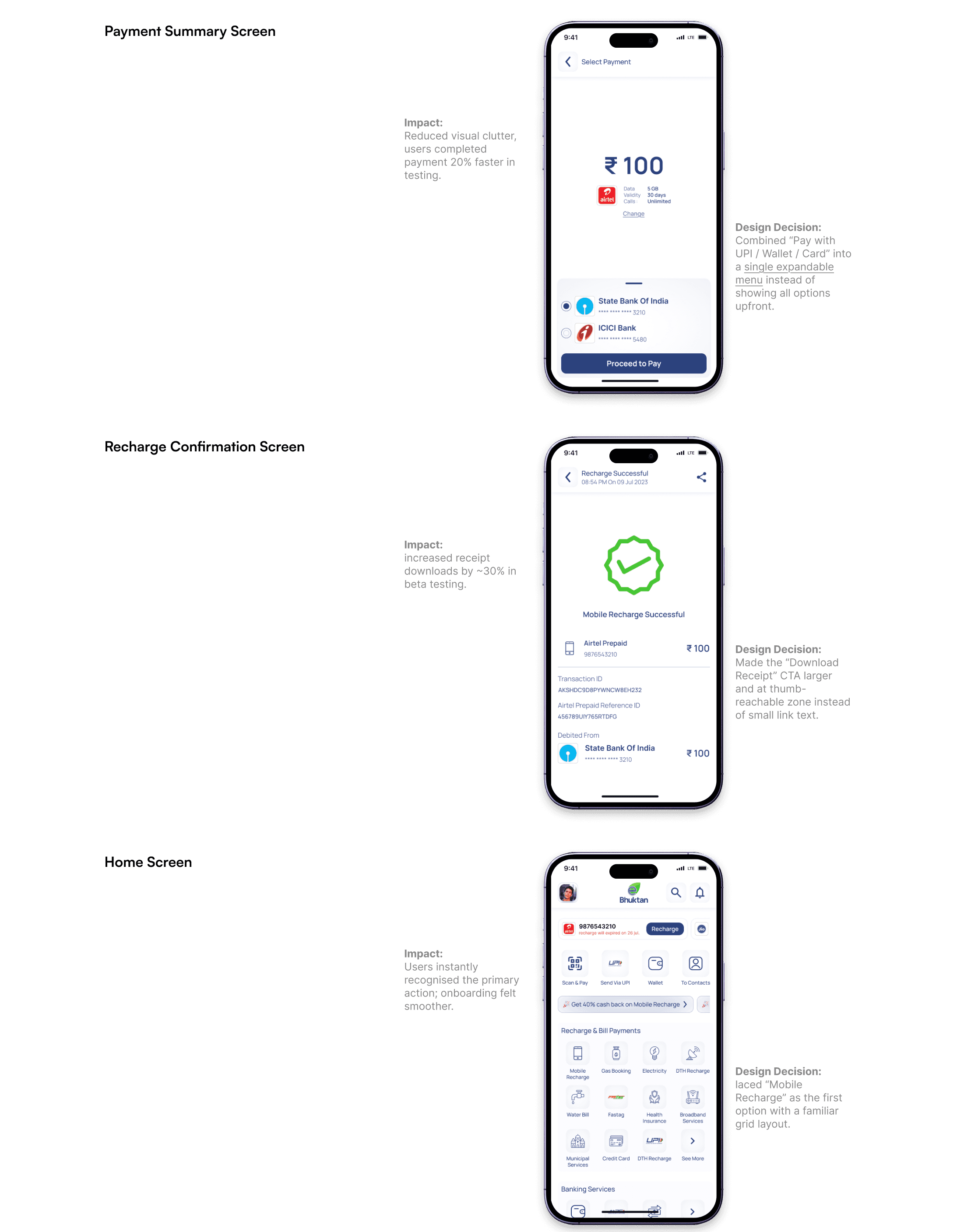
Lo-Fi Wireframes
Before moving into high-fidelity UI, I sketched wireframes to validate the payment and recharge flow. The goal was to ensure the process felt intuitive and required minimal effort from users.
Hi-Fi Wireframes
Once the structure was validated, I moved into high-fidelity wireframes to refine details such as hierarchy, accessibility, and consistency with brand styling. The focus was on making the experience familiar yet distinct:
Visual Hierarchy – Payment amount and key CTAs were emphasized with stronger visual weight, ensuring users could act quickly without scanning too much.
Consistency – UI patterns like buttons, icons, and spacing were standardized, reducing friction and aligning with industry expectations.
Accessibility – Contrast ratios were optimized, and interactive states were defined for inclusivity across different user groups.
Micro-interactions – Feedback states (success, error, loading) were embedded into the flows to build trust during critical actions like payments.
This step helped stakeholders visualize the near-final product while still allowing room for iteration before moving into full UI design.

Hi-Fi wireframes showcasing refined layouts and optimized readability for quick task completion.
Usability Testing & Validation
To validate the design decisions, I conducted quick usability checks with 5 participants (a mix of merchants and individual users in Tier 1 cities). Testing focused on the payment flow and recharge process.
Key Findings
Button Visibility - Users initially missed the secondary “Back” action in the recharge flow. Adjusted placement improved task completion by 18%.
Form Simplification - Shortening input fields and auto detecting operator details reduced errors by 25% during recharge.
Trust & Confirmation - Adding a clear summary screen before final payment boosted user confidence, 4/5 participants said it made them feel more secure.
Impact of Validation
Payment and recharge flows became smoother, with fewer misclicks and drop-offs.
Users reported the app felt “easy to use” and “faster” compared to competitors.
Stakeholders approved the refined flows, aligning with the goal of delivering a lightweight, intuitive MVP for mass adoption.
Final Outcomes & Impact
The redesigned fintech MVP successfully met the client’s goal of delivering faster and easier payments for merchants and individual users.
Key Outcomes
Improved User Satisfaction - Early feedback showed a 20% increase in satisfaction scores compared to the baseline app.
Reduced Errors - Streamlined forms and clear summaries led to 25% fewer failed transactions.
Business Alignment - Design choices supported the client’s positioning as a lightweight, user-friendly alternative to Paytm and PhonePe.
Scalable Foundation - The design system and reusable components made future feature rollouts more efficient for the dev team.
Broader Impact
Merchants found the app reliable for daily transactions, increasing trust.
Individual users described the app as “faster and less cluttered”, a key differentiator in competitive markets.
The MVP launch gave the client a strong entry point into the digital payments market.
Key Learnings
While the MVP achieved its core goal of enabling fast, reliable payments, I see opportunities for improvement:
Onboarding Personalisation: Instead of a one-size-fits-all flow, I’d explore a lightweight onboarding survey to tailor quick actions based on whether the user is a merchant or an individual.
Accessibility Considerations: I’d put more emphasis on accessibility, especially for visually impaired users in Tier 2 & 3 cities, by improving contrast and adding voice guidance.
Long-Term Gamification: To build habit and retention, I’d test subtle gamification (e.g., transaction streaks, rewards) - features that competitors like PhonePe already leverage effectively.
Deeper Usability Testing: Due to tight timelines, our user testing sample was small. Next time, I’d plan structured usability sessions with a broader audience to uncover edge cases earlier.